A new look for your leaderboards: 18 themes, 4 layouts
A fresh design for Leaderboarded — 18 themes, 4 layouts, bigger fonts on demand, per-rank emojis, and customisable colours. Here's what's new.
Article Contents
Update — May 2, 2026: V2 is now the default for new leaderboards. Every new leaderboard you create will use the new design. Your existing leaderboards still render exactly as they do today on the classic V1 — nothing changes for them. If you want to keep building on V1, clone an existing V1 board and the copy stays on V1. Note: this only affects standard leaderboards — score sheets, team leaderboards, goal trackers, multi-column boards, and the other board types are unchanged.
Same data, same API, brand new look. Here's what shipped.
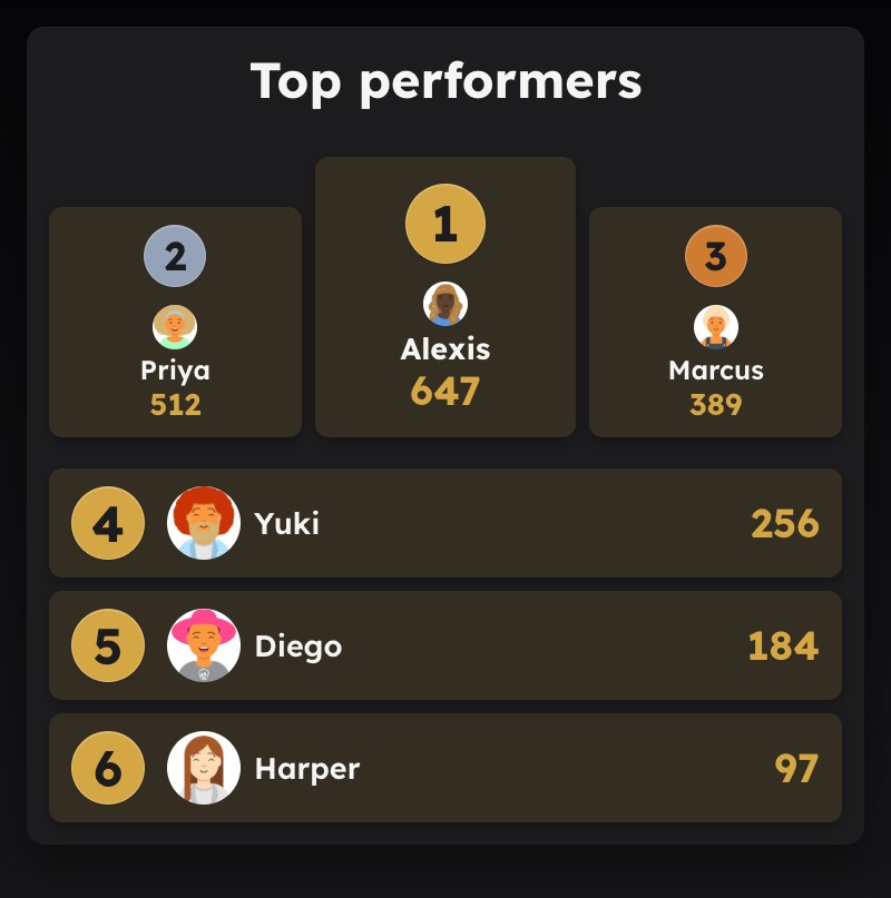
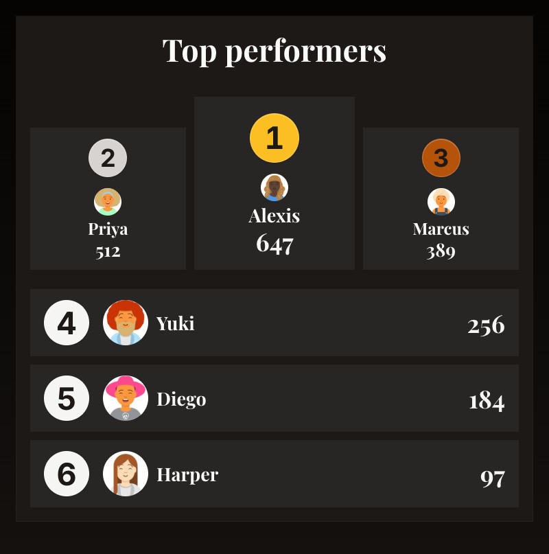
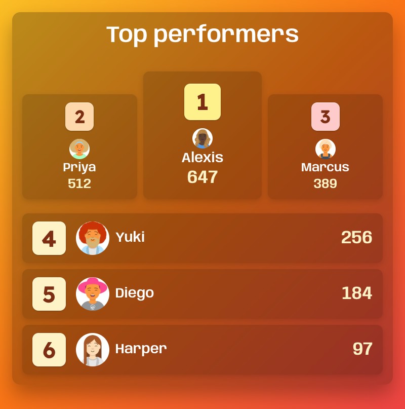
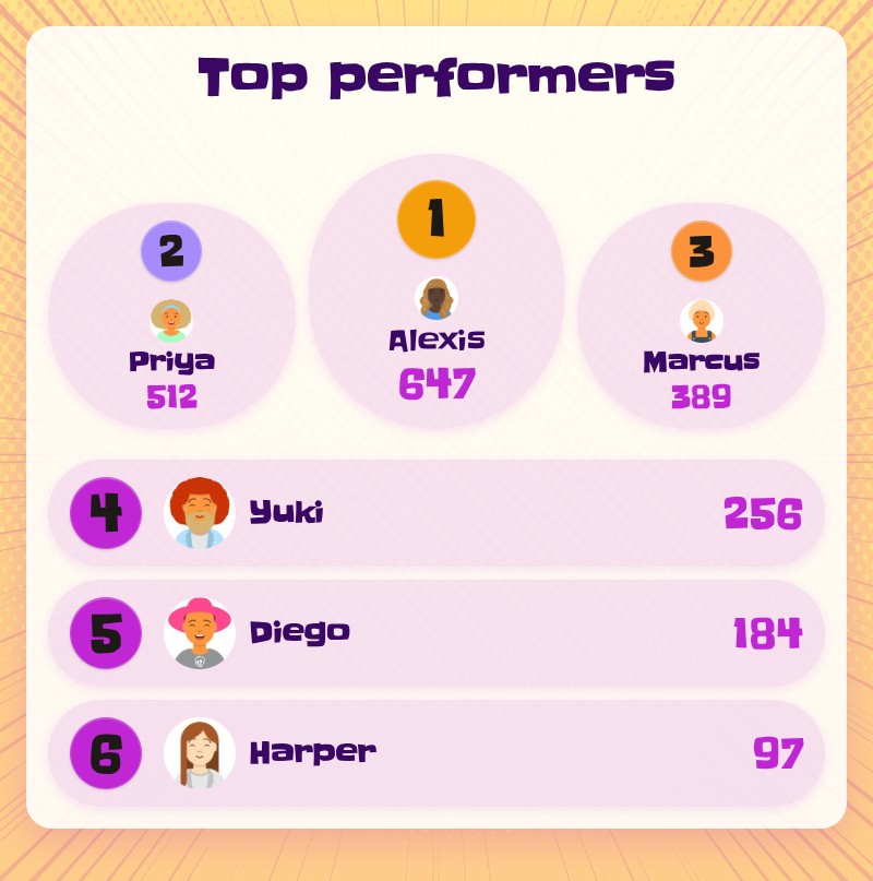
18 themes to pick from
Each one is its own look — not a photo background with a colour filter, but a deliberate design with its own typography, surface treatment, and accent palette. A few favourites:
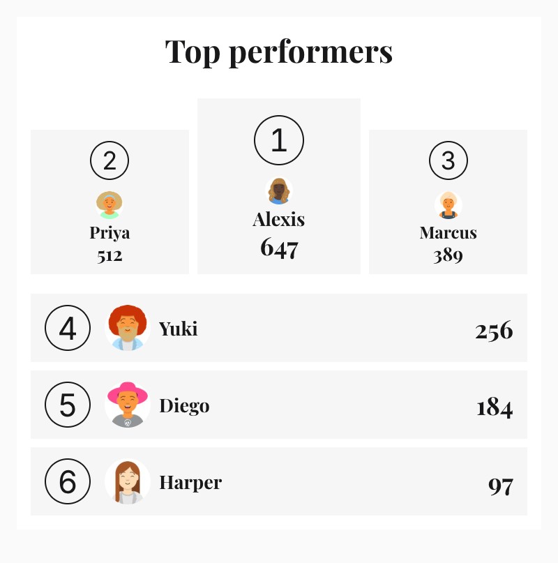
Minimal Editorial — magazine-style, zero ornament.
Noir Luxury — warm black, gold 1st place.
Fiesta — loud, celebratory, fundraiser energy.

Classroom — warm, friendly, readable from across a room.
Sales Champion — dark navy, built for office TVs.
Candy Pop — pastel gradient, playful, pill badges.
Plus Default, Gaming, Dark, Bold, Golf, Neon Cyberpunk, Corporate Slate, Iron Athlete, Fundraiser, Pub Quiz, Academy, and Fresh Start.
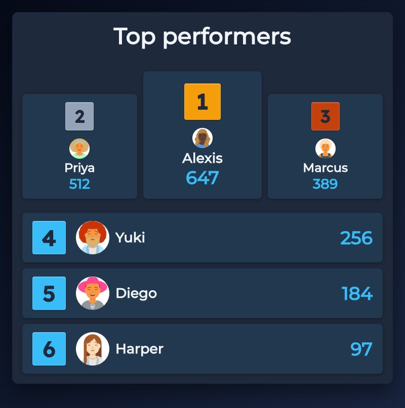
Four layouts
Same data, totally different feel:
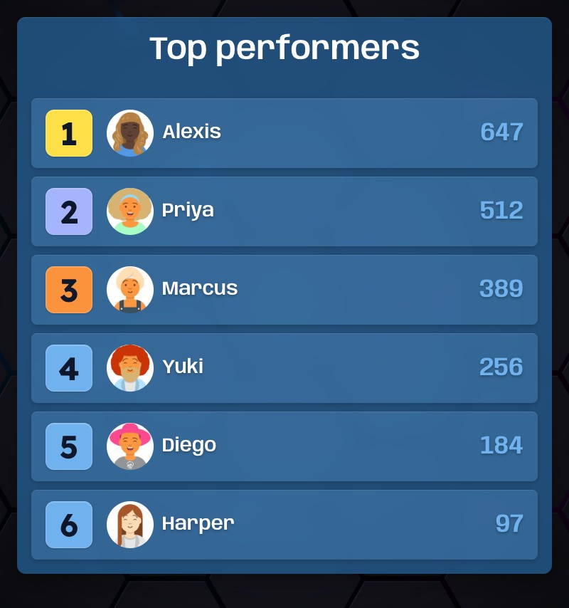
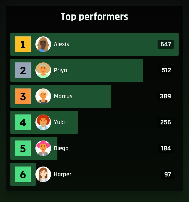
List — the classic. Works for 3 people, works for 500.
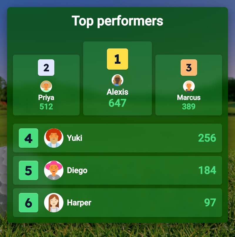
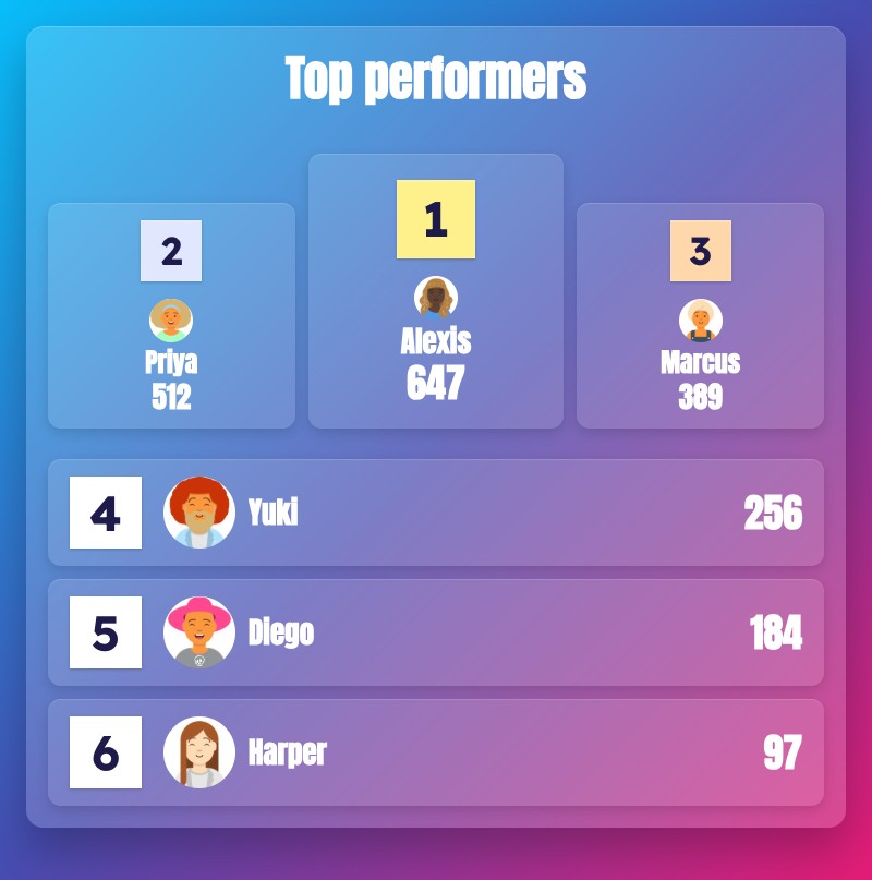
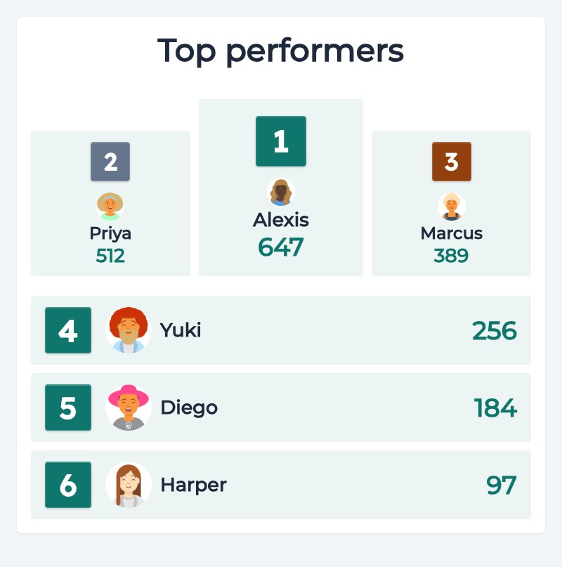
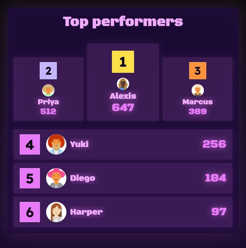
Podium — Olympic-style top 3. For awards nights.
Bars — horizontal bars sized to score. Great on a TV across the room.
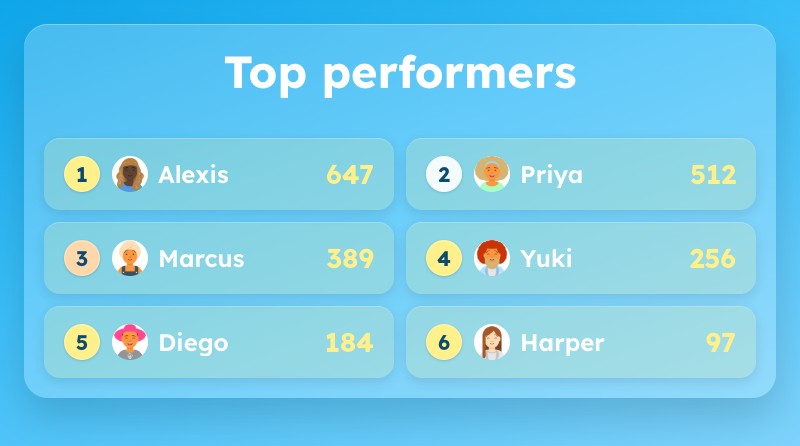
Cards — reflows into columns for dashboards with lots of people.
Switching layouts is one click. Rows slide into place rather than jumping.
Make it yours
A handful of new knobs in the Appearance panel:
- Density — compact, comfortable, or spacious.
- Font size — drag the slider from 75% to 200% to match the room. Small for a sidebar, huge for a projector.
- Colour overrides — change the accent, text, row background, or any of the three medal colours. Leave anything blank to use the theme default.
- Per-rank emoji — 🏆 for first, 🔥 for second, 🎯 for third. Or any emoji at all. Built-in picker.
Bold — vivid gradient, glass cards.
Corporate Slate — clean, teal, B2B-ready.
Neon Cyberpunk — dark purple, neon pink accents.
A better scorekeeper view
When you share the scorekeeper link with someone during a match, the board now hides the title block and keeps the font size compact. The scoring buttons stay on screen where you need them. The public-facing board keeps its full look.
Try it
Create a new leaderboard and you'll get the new design. Existing boards stay on the classic version.
Beta
Try the new design — 18 themes, 4 layouts, free to use while in beta.
Try the betaIt's still in beta — got feedback? Email us — we read every reply.
Built for real use: TVs in sales offices, embeds in fundraiser pages, smartboards in classrooms, a second monitor on trivia night. If that's your setup, this should feel like it's finally built for you.
Common Questions
"Do I need to do anything to get the new design?"
No. New leaderboards get the new design automatically as we roll it out. Existing boards stay on the classic version.
"Will my existing boards still work?"
Yes. Existing boards keep rendering exactly as they do today — nothing changes for them.
"Are the new themes free?"
All 18 themes are free. Custom colour overrides are a paid feature.

Written by Caspar von Wrede
Founder of Leaderboarded. Building tools that help teams track progress and stay motivated.


