How to Create Your Own Live Bar Chart Race
Create your own live bar chart race online. No coding required. Great for competitions, quizzes, online events, sales teams and more.
Article Contents
At carnival horse races, players sit at skee-ball tables and roll balls into holes. Each score nudges their horse forward on the track. The thrill isn't the game mechanics — it's watching the horses creep toward the finish line, overtaking each other with every throw.
Bar chart races capture that same energy for data.
 When races were simpler
What Makes Bar Chart Races Work
A standard bar chart shows data at one point in time. A bar chart race shows how that data changes — across days, months, years, or centuries. The bars grow, shrink, and swap positions as the timeline advances.
Population growth is a classic example: watch cities rise and fall over decades, with Mumbai overtaking New York, then Shanghai passing both. But the format works for any data that shifts over time: sports records, sales figures, election results, social media followers.
The animation transforms dry statistics into something people actually watch. Static charts get skimmed. Bar chart races hold attention.
Where Bar Chart Races Work Best
Sports statistics. Olympic records improve incrementally. A bar chart race showing the fastest 100m times since 1896 makes those incremental gains visible — and dramatic.
Quiz nights and events. Track team standings across a season of pub quizzes. Which team dominated? Who made a comeback? The race tells the story better than a final leaderboard.
Algicosathlons and competitions. After each round, update scores to show real-time ranking shifts. At the end, play back the full race to see how positions changed throughout the event.
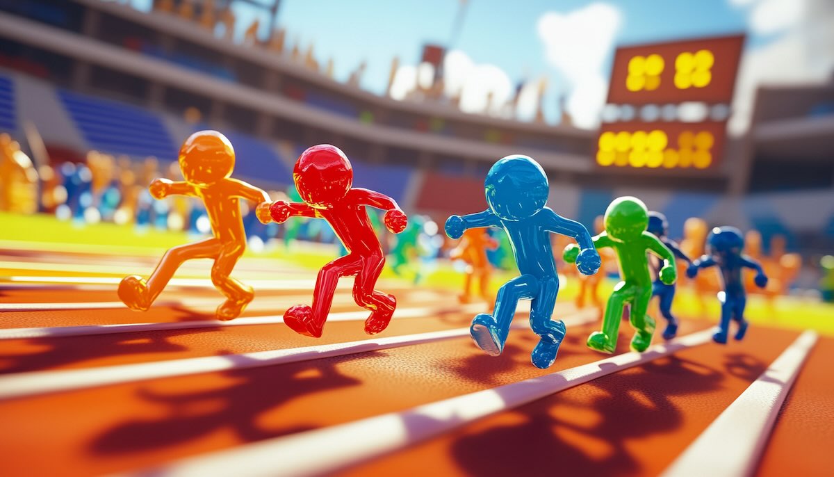 This is what an algicosathlon could look like in real life.
Sales team motivation. Show how different campaigns performed over the year. Which Q4 push actually worked? Which rep climbed from last to first?
Fitness tracking. Monitor improvement across a workout group. Who gained the most strength? Whose endurance improved most consistently?
Creating a Live Bar Chart Race with Leaderboarded
Most bar chart race tools require uploading a spreadsheet with all your data upfront. That's fine for historical analysis. But what if scores are changing as you watch?
Leaderboarded's bar chart race updates live. Here's what makes it different:
No file uploads required. Click the point boxes to add or subtract points. No spreadsheets, no file format conversions, no data prep.
Real-time updates. Change scores during a live event and watch the bars move immediately. You don't have to wait until the game ends to show the race.
Easy adjustments. Added a new team? Removed a participant? Make changes without rebuilding the entire visualization.
Works for the tech-averse. If you can click a button, you can run a live bar chart race. No technical knowledge needed.
One limitation to know: Leaderboarded creates live bar chart races, not recorded playbacks. This makes it ideal for events happening in real-time, but not for generating video files of historical data.
Avoiding Common Mistakes
Too many bars. A race with 50 entries becomes unreadable. Stick to 10-15 participants maximum. If you need more, consider grouping or filtering.
Missing context. Viewers need to understand what they're watching. Add a clear title, label your units, and explain the time period. "Sales by Region (Q1-Q4 2024, in thousands)" tells a clearer story than just "Sales."
Updates too slow. The excitement comes from watching movement. If your bars only shift once per hour, the "race" loses its energy. Update frequently during live events.
Data doesn't have to be boring. A well-designed bar chart race turns numbers into narrative — showing not just who won, but how the competition unfolded. Try Leaderboarded's live bar chart race for your next event and see the difference animation makes.
FAQ
How do bar chart races work?
Bars represent categories (teams, countries, people) and their lengths show a value (points, population, sales). As the timeline advances, bars grow and shrink, changing positions to reflect the underlying data.
How are bar chart races different from static bar charts?
A static bar chart shows one moment in time. A bar chart race shows change over time — letting viewers see trends, reversals, and patterns that a single snapshot would miss.
What data works best for bar chart races?
Any data that changes meaningfully over time: population statistics, sports records, sales figures, election results, fitness metrics, competition scores. The key is having enough variation to make the "race" interesting.
What's the ideal number of participants?
Between 5 and 15 works best. Fewer than 5 lacks visual interest. More than 15 becomes hard to follow. If you have more categories, consider showing only the top performers or grouping related entries.

Written by Caspar von Wrede
Founder of Leaderboarded. Building tools that help teams track progress and stay motivated.